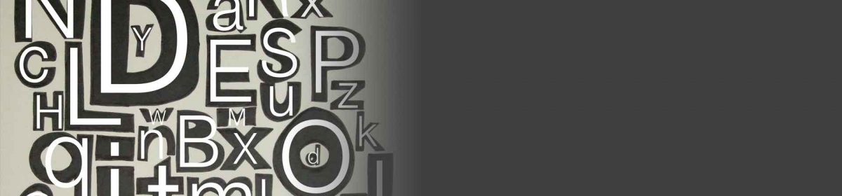
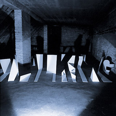
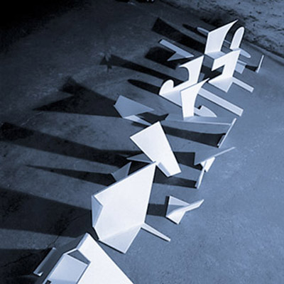
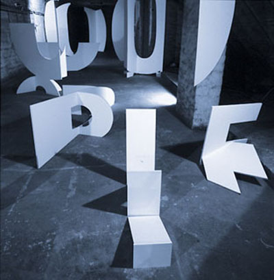
Eine sehr schöne typografische Installation namens t.s.e. hat Sebastian Lemm gestaltet. Es wurden im Raum unterschiedliche Buchstaben positioniert und mit dem Raum verschmolzen, durch entsprechende Formgebung. Diese Arbeit wurde im Zeitraum 1999-2004 realisiert und dürfte selbst Heute immer noch eine sehr faszinierende Ausstrahlung haben.
Sebastian Lemm wurde in Deutschland geboren und lebt mittlerweile in die U.S.A..
Informationen zu seiner Person, direkt von der Homepage:
Sebastian Lemm, a native of Germany, is a widely exhibited and published New York-based artist. Sebastian relocated to New York City in 2000 after receiving a diploma (MFA equivalent) from Berlin University of the Arts, and continued creating photo-based work.
Selected by Adam Fuss, Jack Pierson and Cindy Sherman to be part of Sean Kelly Gallery’s “Unframed First Look” exhibition (2004), which presents emerging artists who are expected to shape the future of the art world, all of Sebastian’s pieces in the show were sold. Since then, Sebastian has had over 30 shows throughout the United States. Notable venues include Platform Gallery (Seattle, WA), Bank Gallery (Los Angeles, CA), Ellen Curlee Gallery (St. Louis, MO), and Margaret Thatcher Projects, Pierogi Gallery, Peer Gallery and Art Omi (all in New York).
Critical recognition has come from 2wice Magazine, Los Angeles Times, Palm Beach Daily News, The Village Voice, several visual art blogs, and most recently, via editorial features in contemporary publications H-Magazine (Spain) and Someone’s Garden Magazine (Japan). The book ‘Light and Lens’ by Robert Hirsch features Sebastian’s work among international artists Edward Burtynsky, Tim Davis, Thomas Demand, Mitch Epstein, Adam Fuss, Andreas Gursky, Jenny Holzer, Martin Parr, Jeff Wall and others.
Sebastian’s pieces are included in numerous private and corporate art collections.
[via]