Neues von Linotype aus dem aktuellen Newsletter:
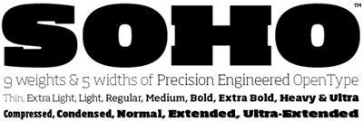
A new typeface family from Monotype Imaging’s Sebastian Lester, Soho is an industrial-strength slab serif typeface. Built for heavy-duty work, its design has been fine-tuned and precision-engineered for the needs of graphic designers creating new corporate design for the 21st century. The Soho typeface family – named after the district in central London – is composed of nine weights and five widths, producing a multitude of options. Each font takes advantage of OpenType technology to offer extensive language coverage, stylistic alternatives, ligatures, and small caps. Purchase individual weights of Soho, or check out any of the five custom-assembled Soho Value Packs!
SOSO