Movie Fonts

Als ich gerade nach einen ähnlichen Service wie MyFonts What the font? gesucht habe, bin ich in den Google Ergebnissen auf eine interessante Unterseite von Linotype gestossen. In der Movie Fonts Sektion werden die Schriften zu bekannten Kinofilmen benannt, so kann man endlich mal prüfen ob man bisher recht hatte mit seiner persönlichen Schrifterkennung :)

Screenshot: Linotype Movie Fonts

TagCloud war gestern …

… heute ist die FontCloud angesagt!

Soeben habe ich im aktuellen LinoType Newsletter einen kleinen Hinweis auf die hauseigenen Fontcloud gefunden:

Welcome to the Linotype FontCloud!
This unique feature offers a randomly chosen view of font products that other visitors have been watching frequently. The bigger an item appears in the cloud, the more people have been interested in it!
Click on the product names to learn more about the specific typefaces.

Bild: Linotype Font Cloud

Mir persönlich hätte eine FontCloud nur mit den Schriftnamen genügt, denn die „komischen“ Farben und auch noch die Darstellung der jeweiligen Schrift ist zuviel des Guten, doch insgesamt eine schöne Idee.

Helvetica NOW Poster Contest Ergebnisse

Gestern kam der LinoType Newsletter pünktlich hereingeflattert und hatte unter anderem folgende Info parat:

Im Sommer 2007 rief Linotype einen Wettbewerb für Poster aus, die mit Helvetica gestaltet sind. Im vergangenen Jahr feierte Helvetica sein 50. Jubiläum und wir waren der Ansicht, dass solch ein Wettbewerb das geeignetste Geburtstagsgeschenk für eine Schrift sein würde. Es gingen Hunderte von Beiträgen ein und Anfang Oktober gaben die Besucher unserer Webseite ihre Stimme für die gelungensten Designs ab.
Sind Sie neugierig, welche Designs ausgewählt wurden? Jetzt können Sie es erfahren – die besten 30 sind auf der Webseite abgebildet. Wir haben diese Seite zusammengestellt, um die preisgekrönten Arbeiten und ihre Autoren vorzustellen. Wir hoffen, Sie haben bei der Betrachtung so viel Spaß wie wir. Oder vielleicht inspiriert ein Werk sogar eins Ihrer nächsten Projekte? Setzen Sie für diese Seite ein Lesezeichen und kehren Sie hierher zurück, wann immer Sie die Magie von Helvetica erleben möchten.

Hier nun die Top 3 des Helvetica NOW Poster Contest:

Poster: Helvetica Now #1
“Bread-and-Butter-Type”
Nina Hardwig, Deutschland

Poster: Helvetica Now #2
“hel()v(s)et(h)icA(s) or hell vs ethics”
Alexandre Rola, Portugal

Poster: Helvetica Now #3
“Today”
Jamal Issawi, Libanon

Helvetica DVD

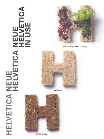
Neues gibt es von meiner Lieblingsschrift Helvetica, wie man heute in zahlreichen Blogs lesen kann, denn am 6. November 2007 erscheint die Helvetica DVD. Die Helvetica DVD wird neben dem Helvetica Film auch einige andere interessante Inhalten anbieten.

Die DVD wird es in zwei Versionen geben:

Helvetica DVD pre-order (Retail version)

The DVD includes the full 80-minute feature film, plus over 90 minutes of additional interviews with Massimo Vignelli, Matthew Carter, Erik Spiekermann, Hermann Zapf, and more. NTSC Region 0, 16×9 anamorphic widescreen presentation, full-color booklet, English and German language subtitles. Release date: November 6. Pre-order now, you’ll save $5 and receive early shipping (a week before street date) and two love/hate Helvetica film buttons.

Helvetica DVD pre-order (Deluxe limited edition)

A limited-edition package in a custom box that includes the retail DVD, three letterpressed mini-posters, a color C-print of a still from the film (one of ten different stills) signed by director Gary Hustwit, two love/hate Helvetica buttons, and a letter of actual Helvetica metal type! We might even throw more cool stuff in there too. Limited edition of 1,000 copies. Release date November 6, pre-order now and receive early shipping (a week before release date).

Weitere Informationen und Preise sind im Shop einsehbar.

Linotype: Cosmiqua

Neues von Linotype aus dem aktuellen Newsletter:

World premiere: Cosmiqua is a newly released, lively serif family from Akira Kobayashi. Inspired by advertising design from the 1950s, Cosmiqua joins formal italics with casual handwriting and 19th century British style, creating letterforms that exude hope for the future while appearing a little odd and kitschy! Cosmiqua itself is an amalgamation of the French word “cosmique,” meaning cosmic, and “Antiqua,” the German term for a serif typeface. Although the family was originally conceived for display uses, it is a serviceable text face as well. Cosmiqua ships as a family of five weights, each with an Italic. All ten of the fonts include oldstyle figures from the Linotype OpenType Com character set, which supports 48 languages and which runs on both the Mac OS and Windows platforms.

linotype cosmiqua

Linotype: Soho

Neues von Linotype aus dem aktuellen Newsletter:

A new typeface family from Monotype Imaging’s Sebastian Lester, Soho is an industrial-strength slab serif typeface. Built for heavy-duty work, its design has been fine-tuned and precision-engineered for the needs of graphic designers creating new corporate design for the 21st century. The Soho typeface family – named after the district in central London – is composed of nine weights and five widths, producing a multitude of options. Each font takes advantage of OpenType technology to offer extensive language coverage, stylistic alternatives, ligatures, and small caps. Purchase individual weights of Soho, or check out any of the five custom-assembled Soho Value Packs!

Komplette Schriftfamilie

Linotype Soho