Neues von Linotype aus dem aktuellen Newsletter:
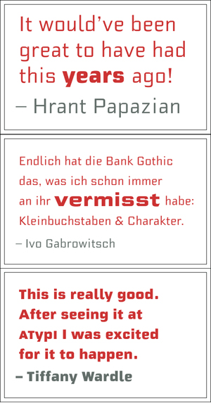
Finally, Bank Gothic with lowercase! Morris Sans™ is a revised and extended version of Bank Gothic, the ever-popular typeface created by Morris Fuller Benton in 1930. Building onto the initial squared capitals-with-a-few-unique-twists design, Dan Reynolds added an original lowercase, as well as several figure options. Small caps, which have become an iconic element over time, are also accessible in each of the family’s fonts as an OpenType feature. This clean, modern face is best suited for headlines, advertising, posters, expressive signage (especially on storefronts), and corporate identity work.
Dank für das Posting!
:)